Intelligence
Overview
The Intelligence dashboard provides enterprises and organizations with valuable insights into the tangible benefits that generative AI (GenAI) users derive from AI assistants. It analyzes the real tasks completed through user prompts and inputs, offering a comprehensive overview of the intelligence gathered from tasks performed by AI assistants deployed via Motifs.
So, what exactly does “Intelligence” entail? This term refers to the insights derived from user prompts, also known as prompt intelligence, which includes detailed analyses of the user inputs relayed to an AI assistant. The objective is to supply business analysts with robust foundational data to enhance their understanding of GenAI utilization. This encompasses:
- Intelligence on the utilization of each Motif you’ve crafted and its adoption by users.
- Insight into the variety of task categories each prompt or user input belongs to.
- The most frequently requested task categories by users, along with token consumption patterns for these categories.
- The efficiency gains achieved through the use of an AI assistant for specific task categories, and benchmarking against other task categories.
This compilation of data and observable trends equips you to make informed decisions and fine-tune the use of your AI assistants. It also facilitates a deeper comprehension of how user inputs transform over time and provides transparency into the actual prompts submitted by users.

On this page you can also view the aggregate data of the prompt intelligence for all the Motifs that you have created. The various graphs displayed on this page are:
-
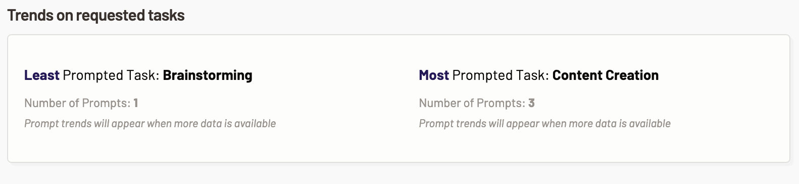
Trends on requested categories across all Motifs: This section showcases the tasks that were requested across all the Motifs by the users the most and the least. Based on this information you can optimize the model usage.
- Least prompted category- This metric shows the prompt trend and the number of prompts for the task category that were least used by the user across all the Motifs.
- Most prompted category- This metric shows the prompt trend and the number of prompts for the task category that were most used by the user across all the Motifs.
-
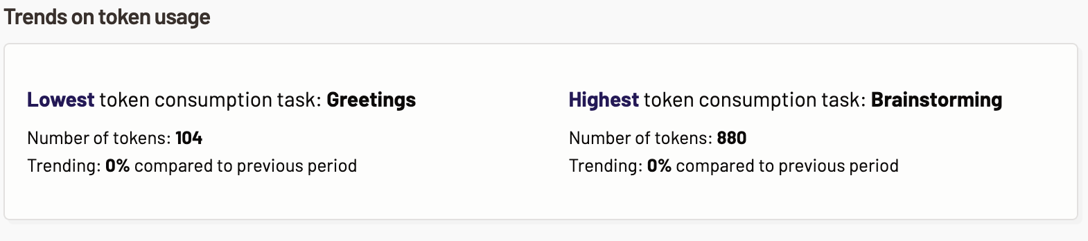
Trends on token usage across all Motifs: This section highlights the token usage trends for requested task across all the Motifs. You can determine which tasks consume the highest or least number of tokens and optimize the cost and LLM usage. The following token usage trends are displayed:
- Lowest token consumption category- The task category with lowest token consumption across all the Motifs is displayed here. Also, the tokens trends of the task with the lowest percent change in the number of tokens is displayed.
- Highest token consumption category- The task category with highest token consumption across all the Motifs is displayed here. Also, the tokens trends of the task with the highest percent change in the number of tokens is displayed.
-
Number of prompts for the top 5 categories: In this section, you are provided with an easy-to-read graphical representation of the top 5 requested task category out of the total prompts requested by the users across all the Motifs that you have created.
-
Categories usage by prompts and time saved: Categories usage by prompts and time saved graph represents what percentage of task categories were requested by the prompts/inputs requested by the users of all the Motifs and how much of the user’s time was saved by using the Gen AI assistant for the tasks.
Motifs
The Motifs you have created are listed and you can view the individual Motif’s prompt intelligence details by clicking on the Motif. The data associated with the Motif such as Least prompted category, Most prompted category, and Total time saved while using the particular Motif are displayed.
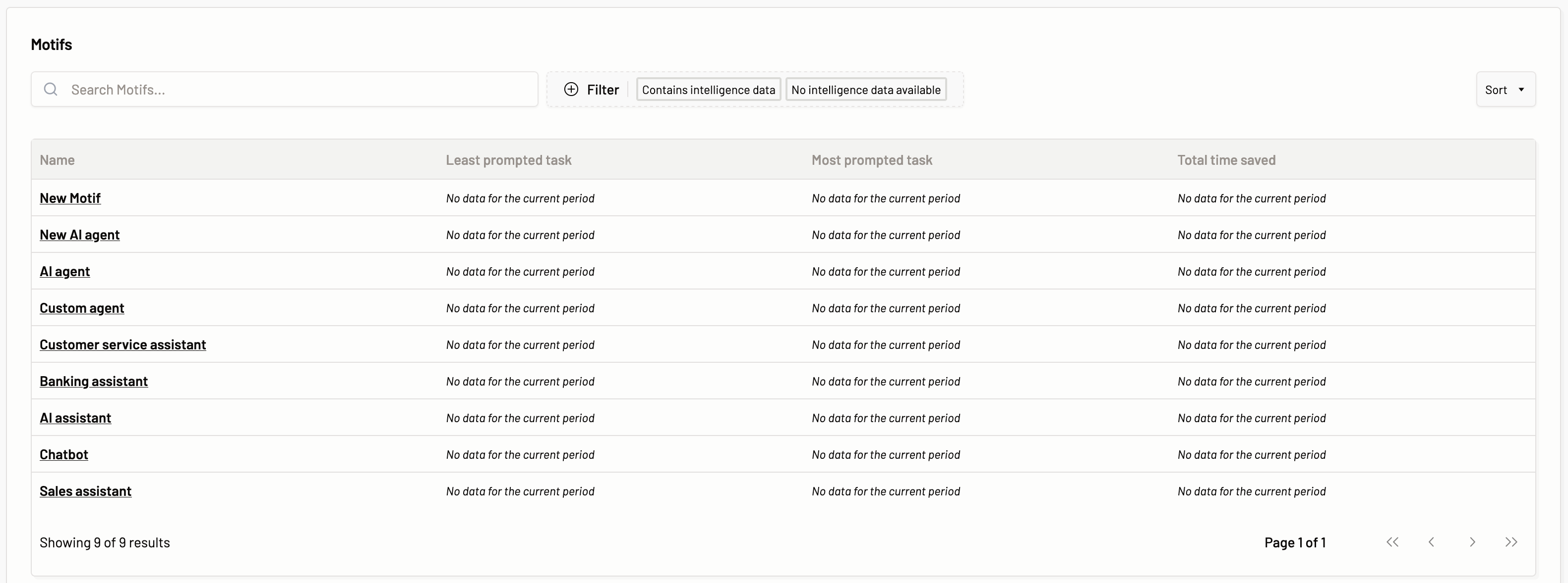
Here, you can filter the Motifs based on intelligence data, i.e., if a GenAI assistant provisioned via a Motif has been utilized by the users for different tasks and prompts have been provided, then there will be prompt intelligence data associated with the Motif and such Motifs can be viewed with Contains intelligence data filter. Whereas if prompts have not been passed for a Motif, then such Motifs can be filtered with No intelligence data.
When you click on the Motif of your choice, you get the following tabs with easy-to-read graphs and metrics about the prompts/inputs from the user that users request for a particular Motif.
Overview
The overview section provides you with the information about the prompts passed to the model via a Motif.
Latest prompts
The latest prompts section the most recent prompts sent by the users of the Gen AI assistant you provisioned via Motific.ai. A prompt classification is also provided.
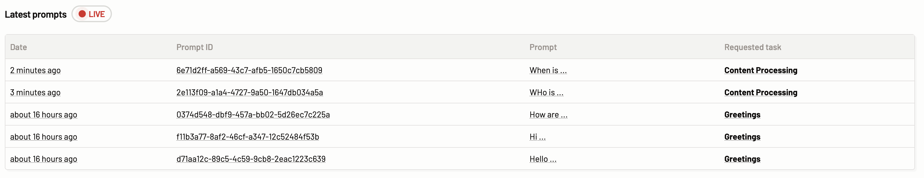 The following details can be viewed:
- Date: The time the prompt was passed to the model.
- Prompt ID: The ID of the prompt.
- Prompt: The user input that is passed by the user to get an inference from the model.
- Requested task: The requested task column represents the task category that the prompt belongs to. The tasks category can one of the following:
- Content Processing
- Coding support
- Brainstorming
- Greetings
- Text translation
- Unclassified
Number of prompts for the top 5 categories
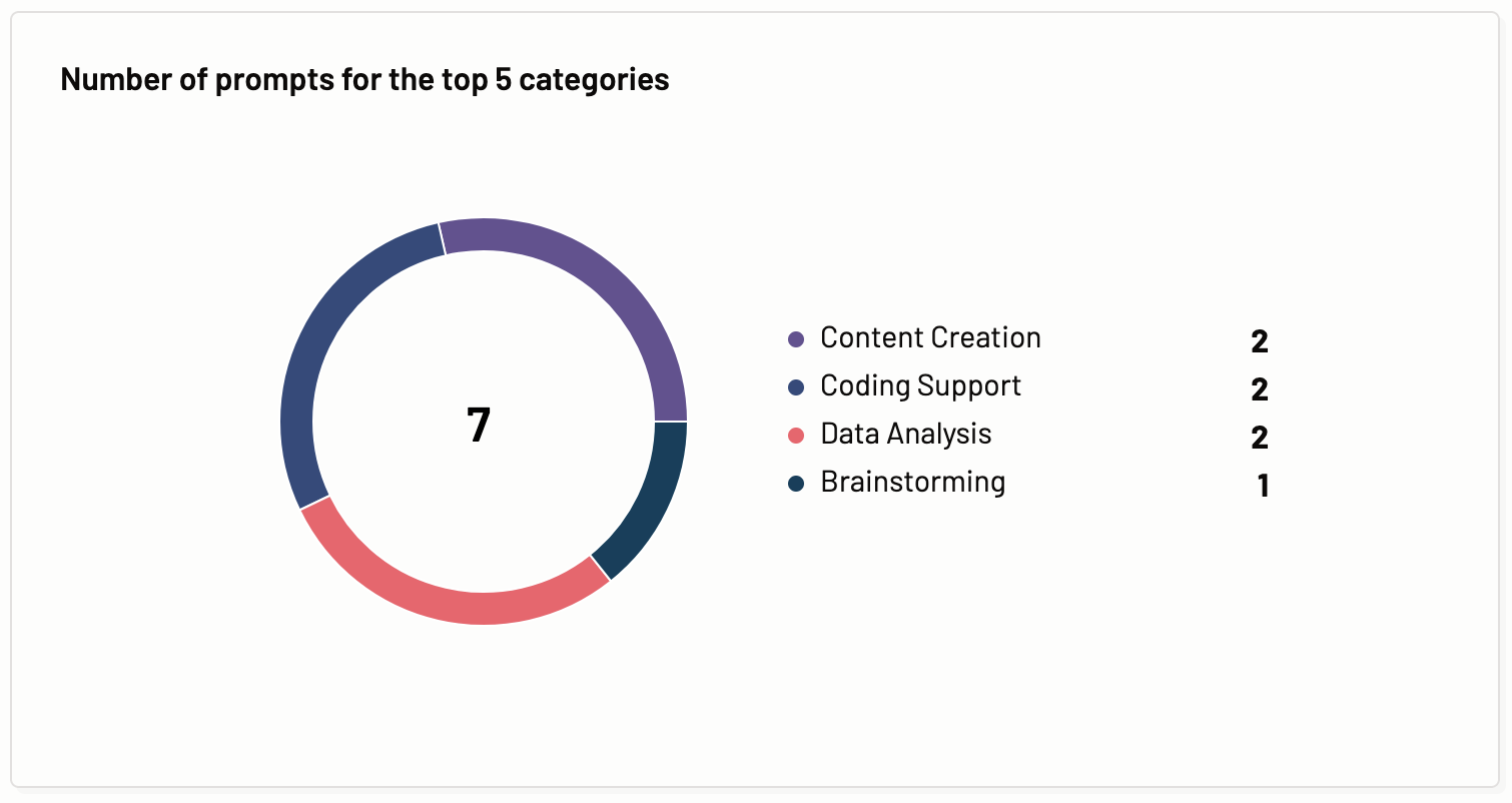
In this section, you are provided with an easy-to-read graphical representation of the top 5 requested task category out of the total prompts requested by the users of a Motif over the selected period.
Categories usage by prompts and time saved
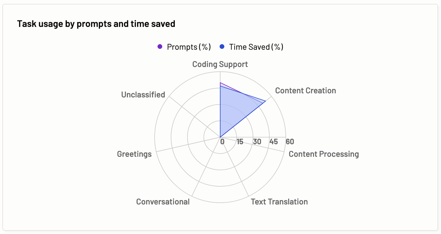
Categories usage by prompts and time saved graph represents what percentage of tasks were requested by the prompts/inputs requested by the users of a Motif and how much of the user’s estimated time was saved by using the Gen AI assistant for the task.
The benefits of these graphs are instant understanding about the type of tasks requested by the Motif users, and the identification of which task categories are saving more time to the Motif users.
Trends on categories with responses
This section showcases the tasks that were requested by the Motif users the most and the least. Based on this information you can optimize the model usage.
- Least prompted category- This metric shows the prompt trend and the number of prompts for the task that were least used by the user while using the Motif.
- Most prompted category- This metric shows the prompt trend and the number of prompts for the task that were most used by the user while using the Motif.
Trends on token usage
This section highlights the token usage trends for requested tasks. You can determine which tasks consume the highest or least number of tokens and optimize the cost and LLM usage. The following token usage trends are displayed:
- Lowest token consumption category- The task with lowest token consumption is displayed here. Also, the tokens trends of the task with the lowest percent change in the number of tokens is displayed.
- Highest token consumption category- The task with highest token consumption is displayed here. Also, the tokens trends of the task with the highest percent change in the number of tokens is displayed.
Time savings by categories
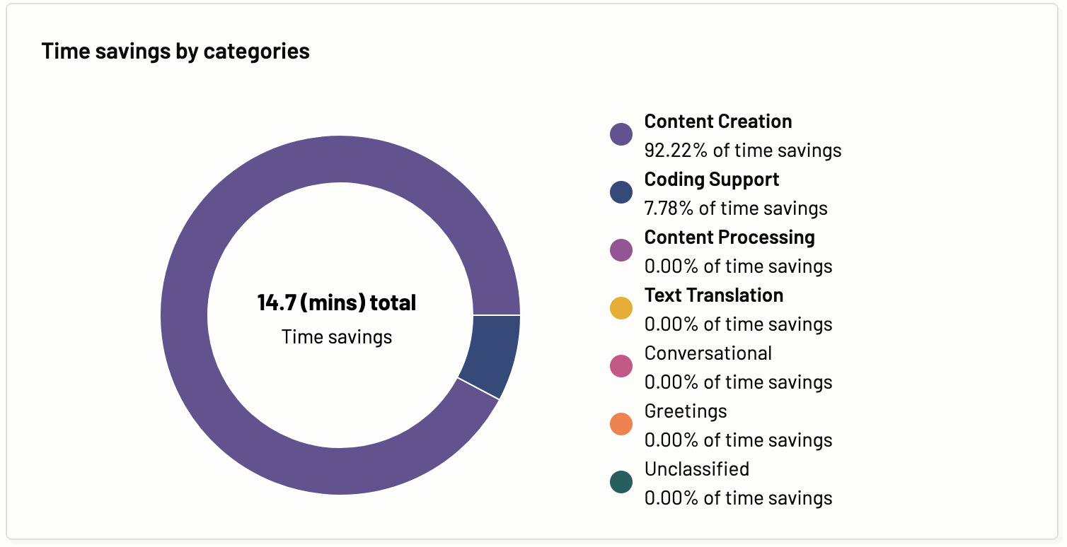
Time savings by categories graph shows the time savings for each of the categories of the prompts sent by the user to the AI assistant. The time savings for individual categories and aggregate of the total time savings.
Category usage
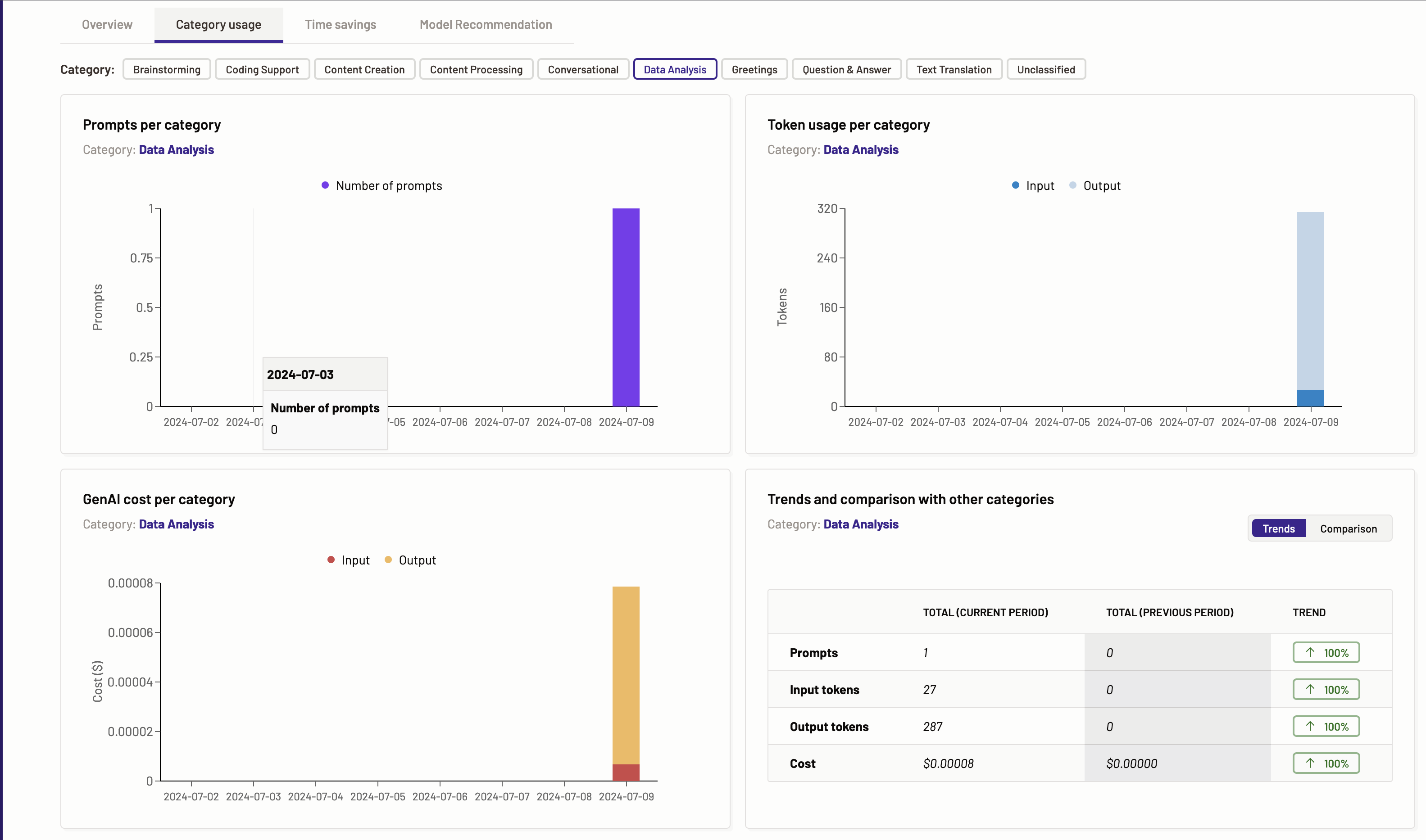
The category usage tab represents how each task category is being requested over time. The user can select which task to display information for.
Based on the various tasks identified by Motific.ai the graphs for prompts per task, token usage per task, Gen AI cost per task, and trends and comparison with other tasks are provided. Each task has its own screen with all the above mentioned graphs and metrics calculated when the data for the specific task is available.
The benefits of these graphs are detailed understanding of the usage, and the understanding of the token consumption and LLM costs for a given task category.
The tasks present in the Motific.ai are as follows:
- Coding Support
- Content Creation
- Content Processing
- Conversational
- Data Analysis
- Greetings
- Question & Answer
- Text Translation
- Unclassified
Let’s dive in and look at each of these graphs for a task. Every task has the same graphs presented with the data for the respective requested task category via the Motif. The graphs can be empty if there is no corresponding data available in the prompts requested by the user.
Prompts per category
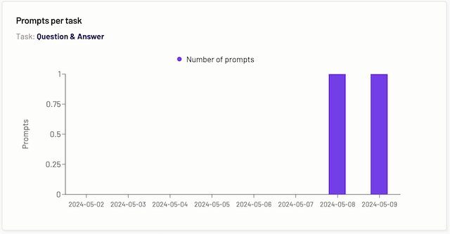
The prompts per task graph displays the data of how many prompts were requested for the particular task over a period of time. The task is determined by which tab you are on. The legend on the graph explains that the number of prompts is signified by a particular color.
Token usage per category
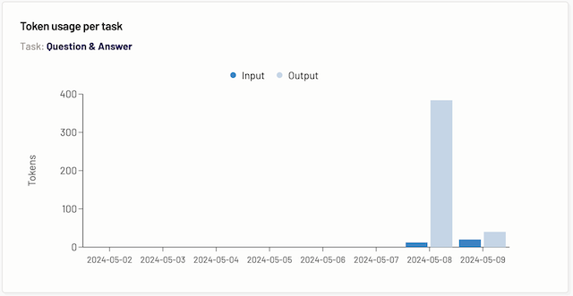
The token usage per task graph displays the data of how many tokens were consumed when a prompt for a particular category was requested by the users of a Motif over a period of time. The task is determined by which tab you are on.
Gen AI cost per category
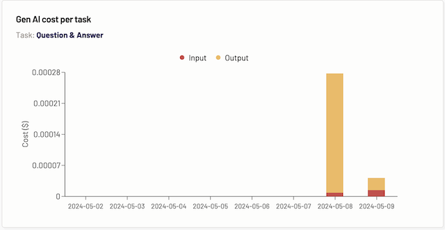
The Gen AI cost per task graph displays the data for the cost incurred over a period of time for the particular task, depending on which task tab you are on.
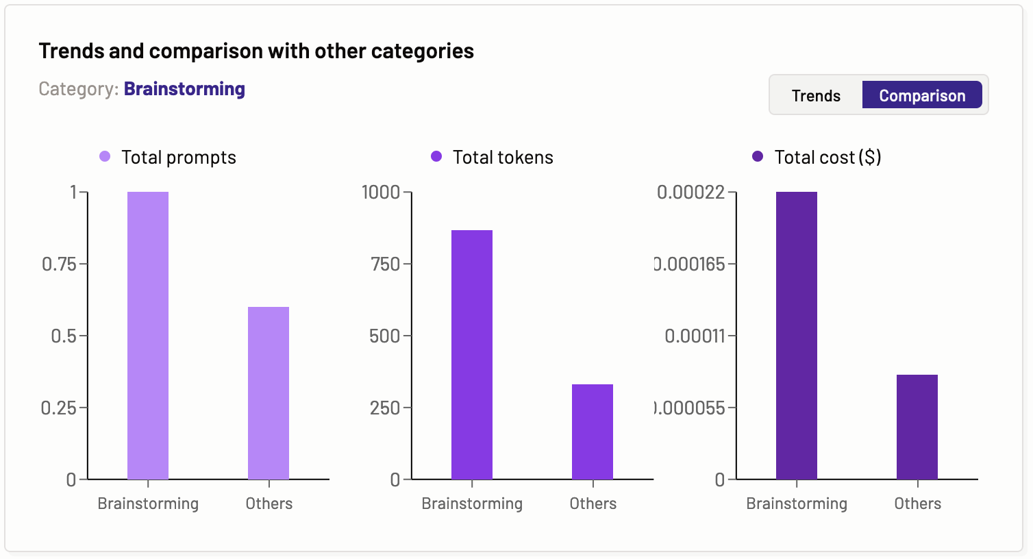
Trends and comparison with other categories
The trends and comparison with other tasks graph provide information about the prompts, input and output tokens, and cost. It compares these entities for the current and past periods of time to show the trends for a particular task. The task is determined by the tab you are on. This graph has two sections, Trends and comparisons. You can select from within the graph what you like to view.
Trends- In the trends graph, you can see the total number of prompts, input and output tokens, and cost of the current and previous periods for a particular task, providing the trends.
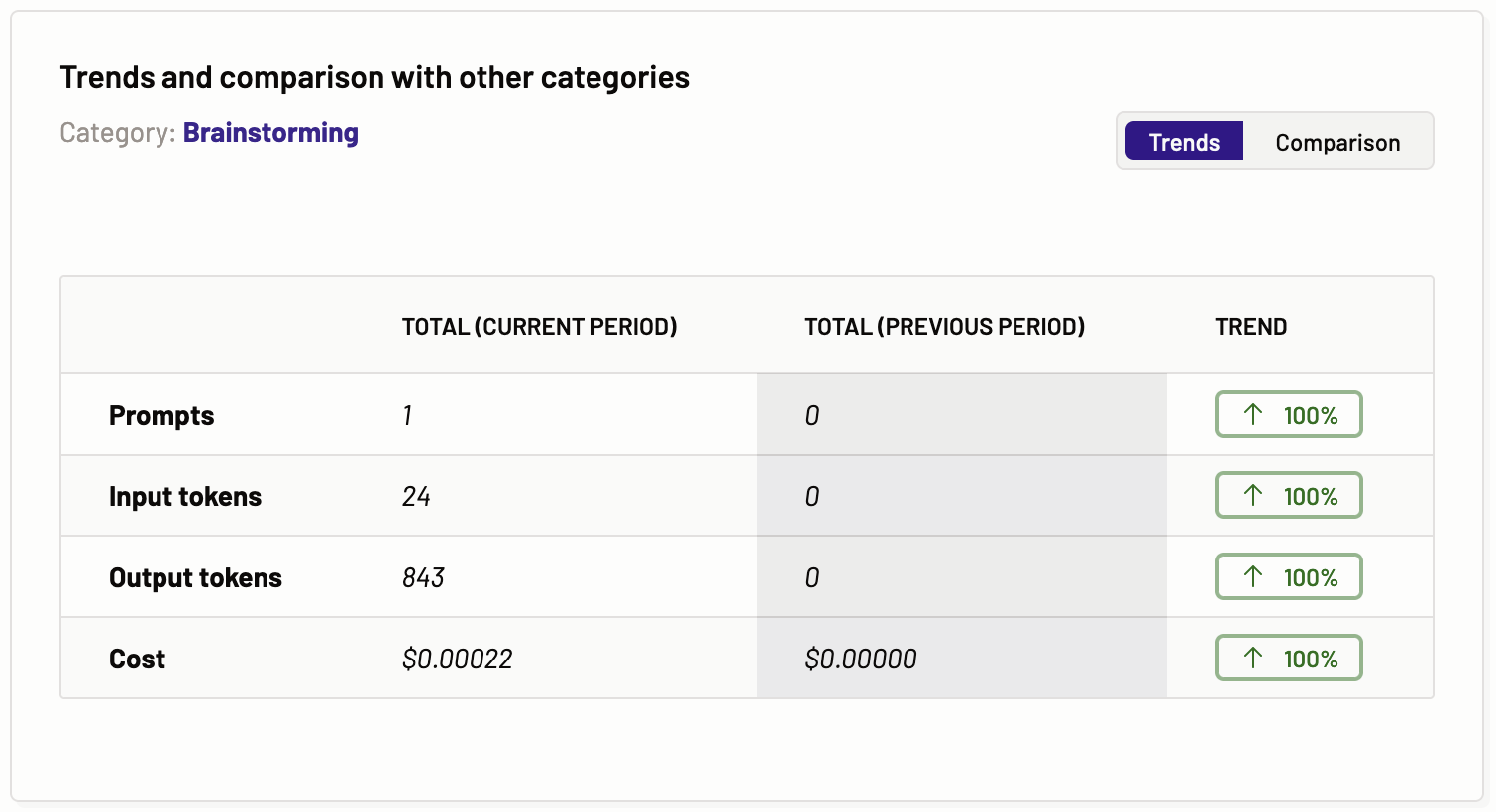
Comparison- In the comparison graph, you can see the comparison of the total prompts, total tokens, and total costs of a particular task with other tasks.
Time savings
Time savings builds on usage insights. It adds estimations of time savings based on per transaction or prompts input from the various users for a particular application.
In the time savings tab, based on the various tasks identified by Motific.ai the graphs for time savings per task, estimated time saved per task, Gen AI cost per task are provided.
The tasks present in the Motific.ai are as follows:
- Coding Support
- Content Creation
- Content Processing
- Conversational
- Data Analysis
- Greetings
- Question & Answer
- Text Translation
- Unclassified
Let’s dive in and look at each of these graphs for a task. Every task has the same graphs presented with the data for the respective time savings.
Time savings per category
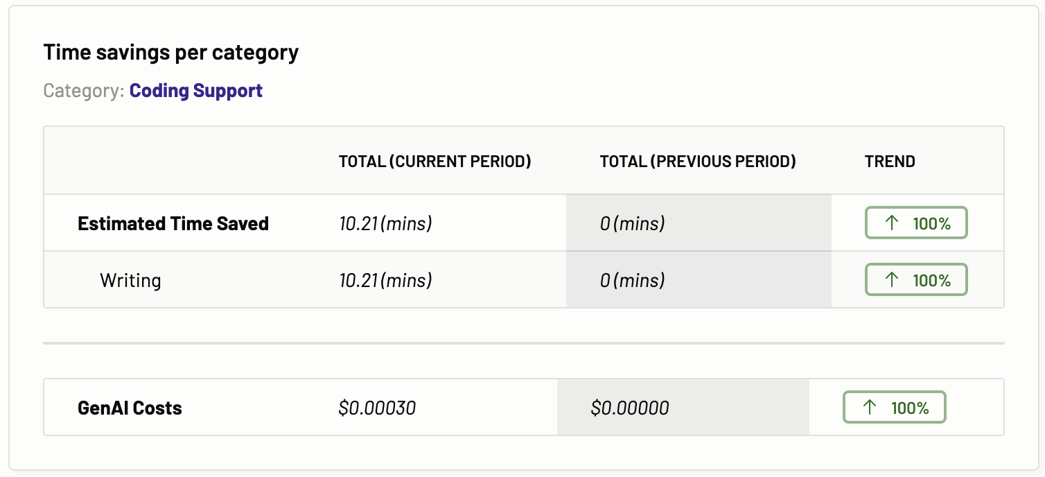
The Time Savings per Task chart details the estimated time saved for each task within a chosen task category, providing a side-by-side comparison with the previous period, and indicates whether the trend is ascending or descending. This chart outlines the estimated time savings and the associated Gen AI costs for tasks initiated by users via a motif, covering both current and prior periods. It also delineates the time saved in activities such as reading, writing, reviewing, and searching related to the task across these periods. The provided data is instrumental in projecting future usage patterns. Identical charts for various task categories showcase the specific data relevant to each task.
The advantage of this analytical comparison is that it highlights whether there has been an increase in user efficiency in interacting with Large Language Models (LLMs) by evaluating the changes in estimated time savings from one period to the next.
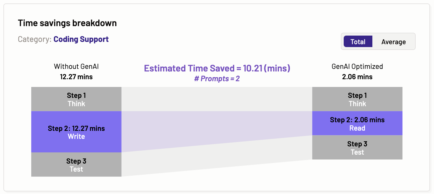
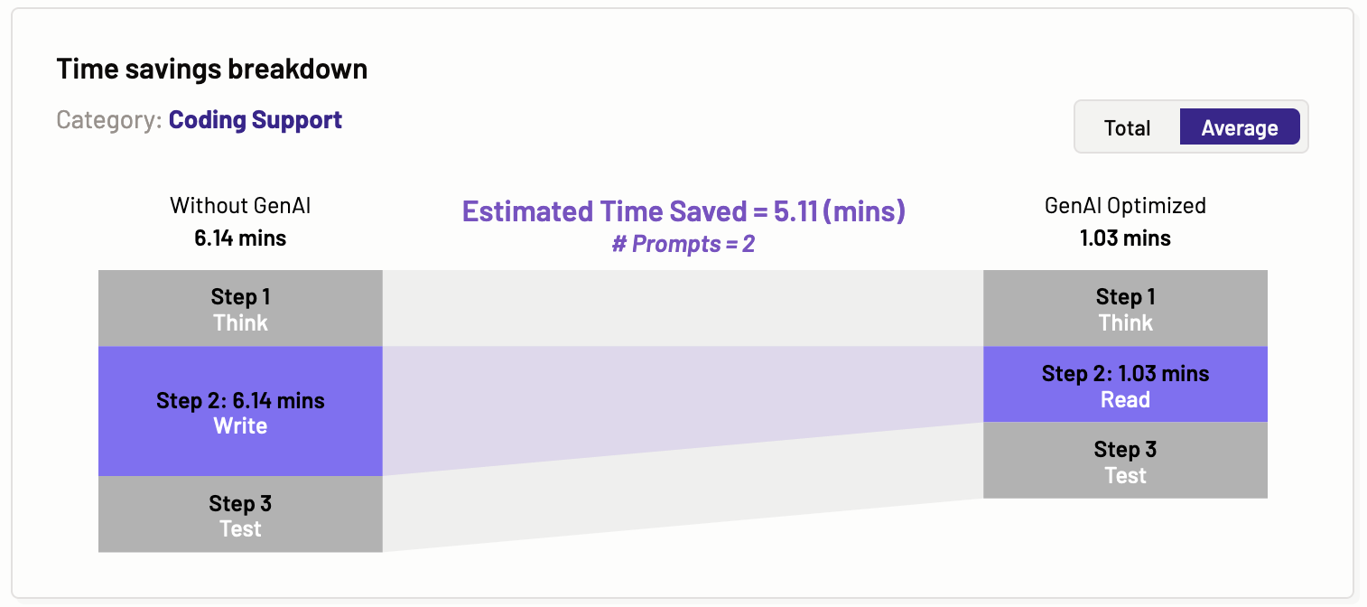
Time savings breakdown
The time savings breakdown graph illustrates the total and average estimated time saved for a specific category of tasks, such as coding support, content creation, and content processing. The steps are categorized as thinking, reading, writing, and testing. Motific.ai then estimates the time these steps would take for a particular task category, both without using GenAI and with using GenAI. This provides valuable insight to organizations on how GenAI tools can enhance user productivity.
Total
Average
Estimated time saved per category
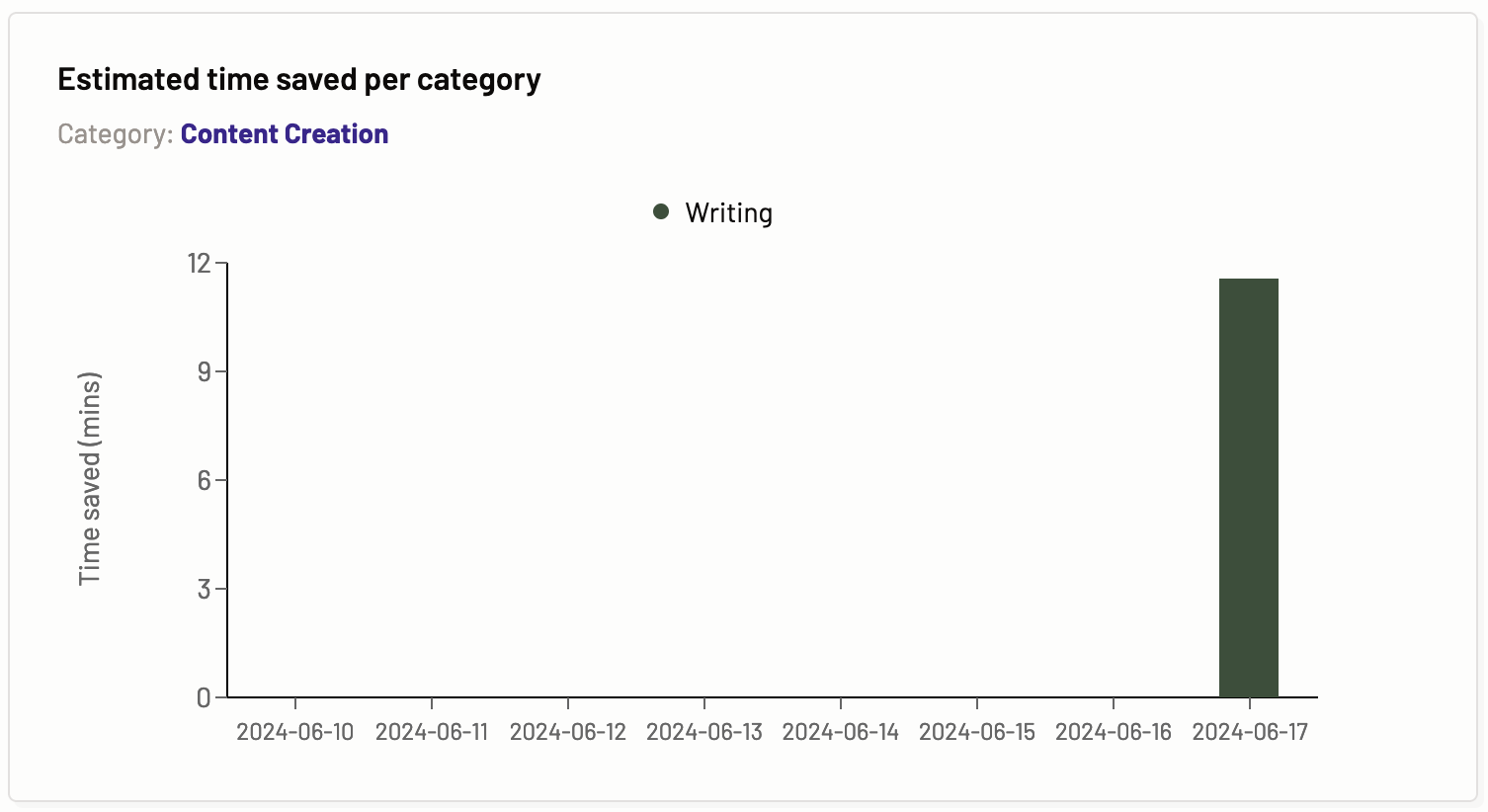
The estimated time saved per task graph provides information about the time saved in reading, writing, testing, and searching by using the Gen AI assistant for a particular task via a Motif over a period of time.
Model recommendation
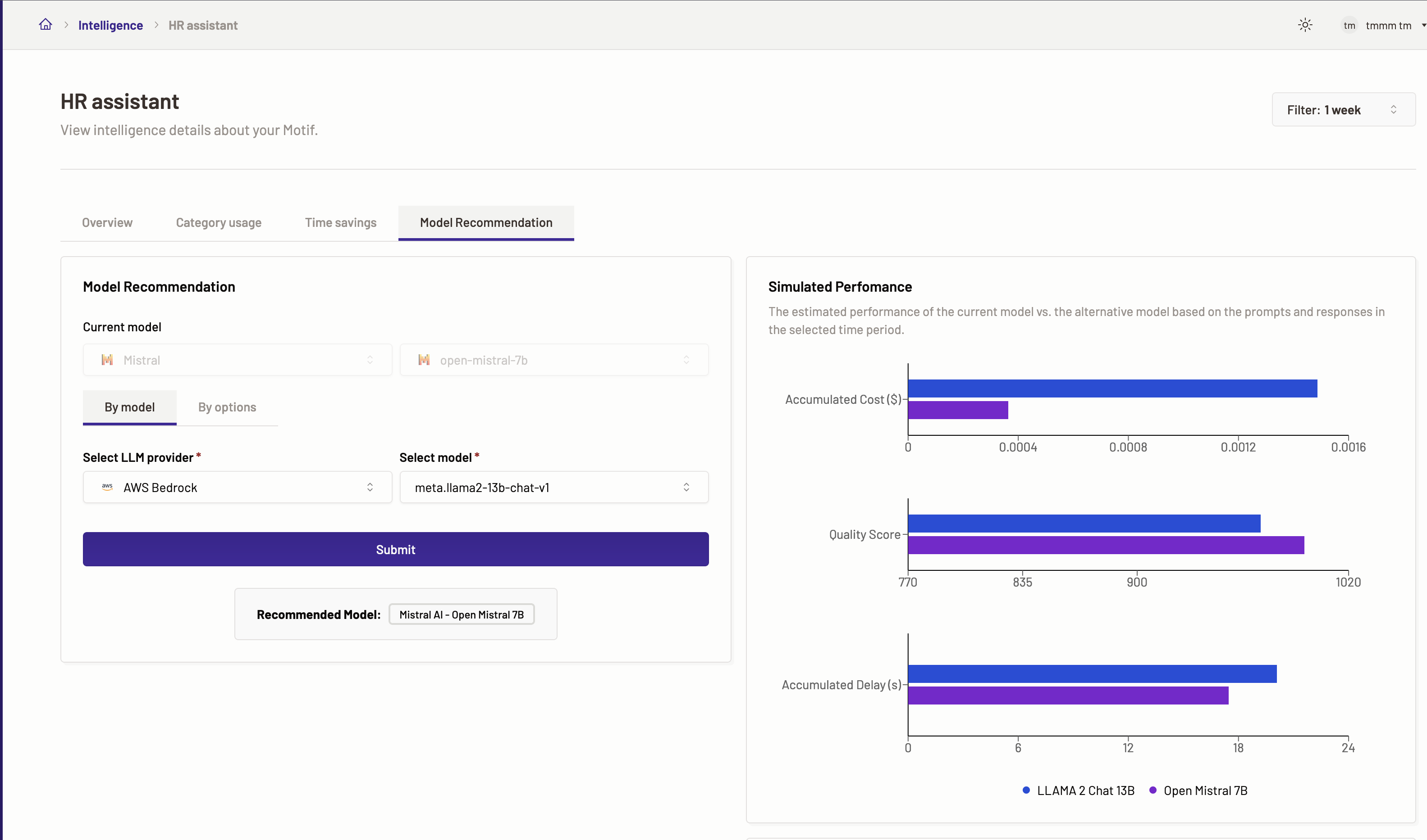
The Model Recommendation feature facilitates a side-by-side evaluation of your Motif’s current model against alternative options, assessing their estimated performance and results over a specified duration based on the given inputs (prompts) and outputs (model responses). Select an alternative model from a list of available models in the dropdown to perform this comparison. Motific.ai intelligently suggests the most suitable model tailored to your needs after reviewing your AI assistant’s performance across various task categories during the chosen timeframe.
This feature enables you to scrutinize and contrast the estimated effectiveness, response time/delays, and overall quality of the model currently in use for your Motif with any other model you’re considering.
Leveraging the Model Recommendation functionality, you can determine whether the optimal model is in place for your Motif, considering the diversity of tasks it handles. By analyzing comparative performance data across different models, you have the option to reconfigure your Motif with a new model to potentially enhance performance and track the resulting metrics and outcomes.
To get the model recommendation, follow the steps below:
- Navigate to the Intelligence menu, click on the Motif for which you want to check the model recommendations. If you have not created a Motif, then create a new Motif.
- Go to the Model recommendation tab.
- Here, you can see that the current model for the Motif has been selected and cannot be changed.
- Next, select if you want model recommendation either by model or by other options and submit the request to see the recommendations.
Model recommendation by model
- For optimization details by model select By model.
- Next, select a LLM provider and a model against which you want to check the optimization details.
- Click Submit.
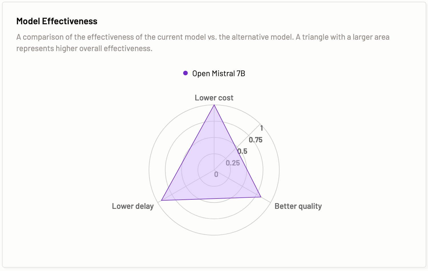
- You can see the results for Simulated performance. The graph displayed shows the comparison for the accumulated cost, quality and accumulated delay(s) of the two models selected. Also, you can view the recommended model
- In the Model effectiveness result tab, you can view a comparison of the effectiveness of the current model vs. the alternative model. A triangle with a larger area represents higher overall effectiveness.
Note: The Submit button is not enabled until there is sufficient prompt data to calculate the optimization details.
Model recommendation by options
- For optimization details by different options select By options.
- Next, select one or more options for which you want to check the optimization details. The options available are cost, delay, and quality.
- Click Submit.
- You can see the results for Simulated performance. The graph displayed shows the comparison for the accumulated cost, quality and accumulated delay(s) of the two models selected. Also, you can view the recommended model
- In the Model effectiveness result tab, you can view a comparison of the effectiveness of the current model vs. the alternative model. A triangle with a larger area represents higher overall effectiveness.